Department of Health Tasmania
Redesigning their website into the modern era
Introduction
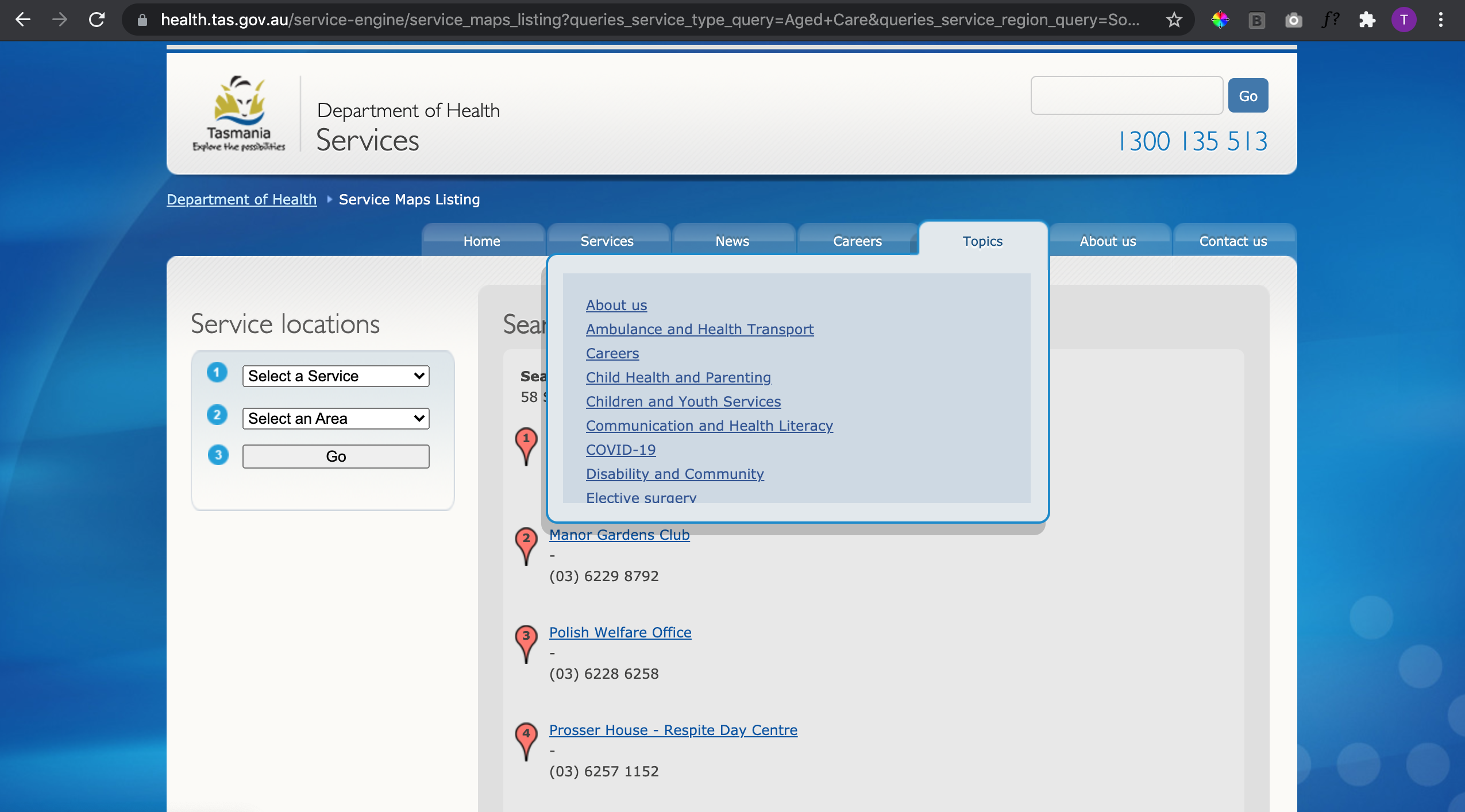
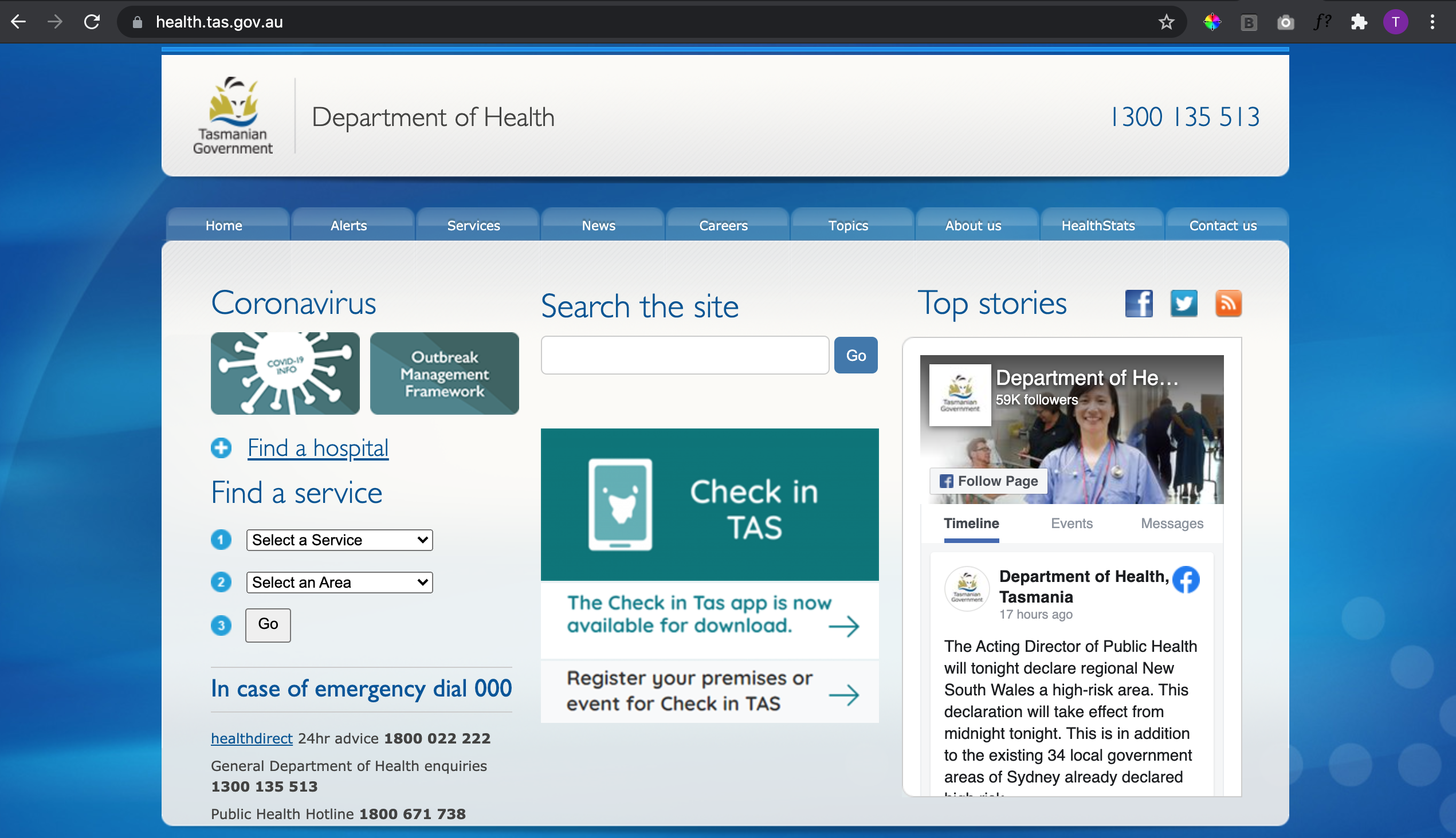
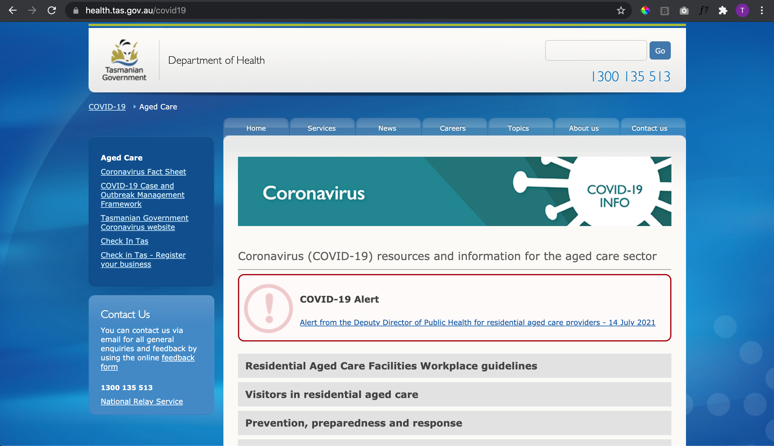
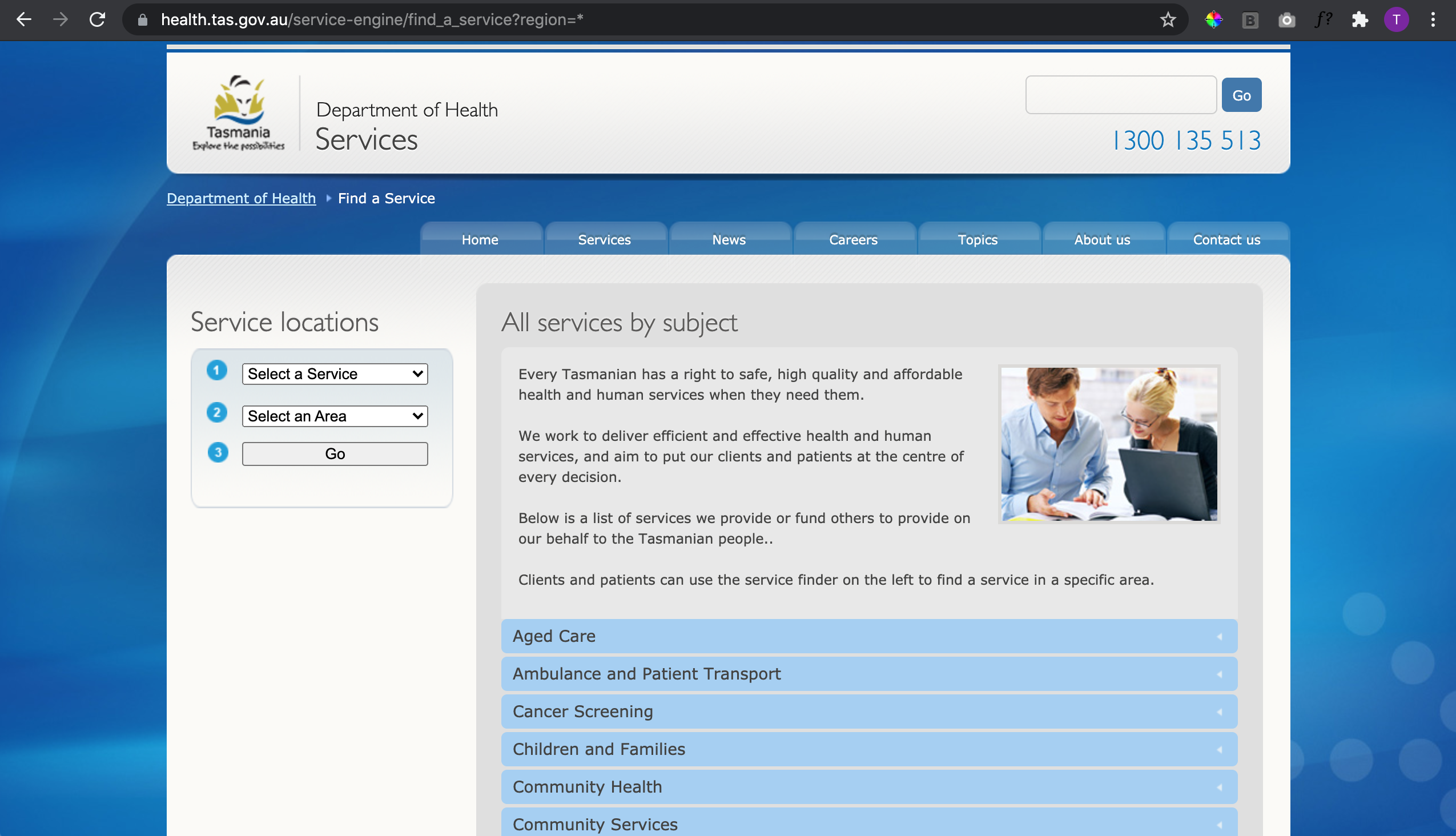
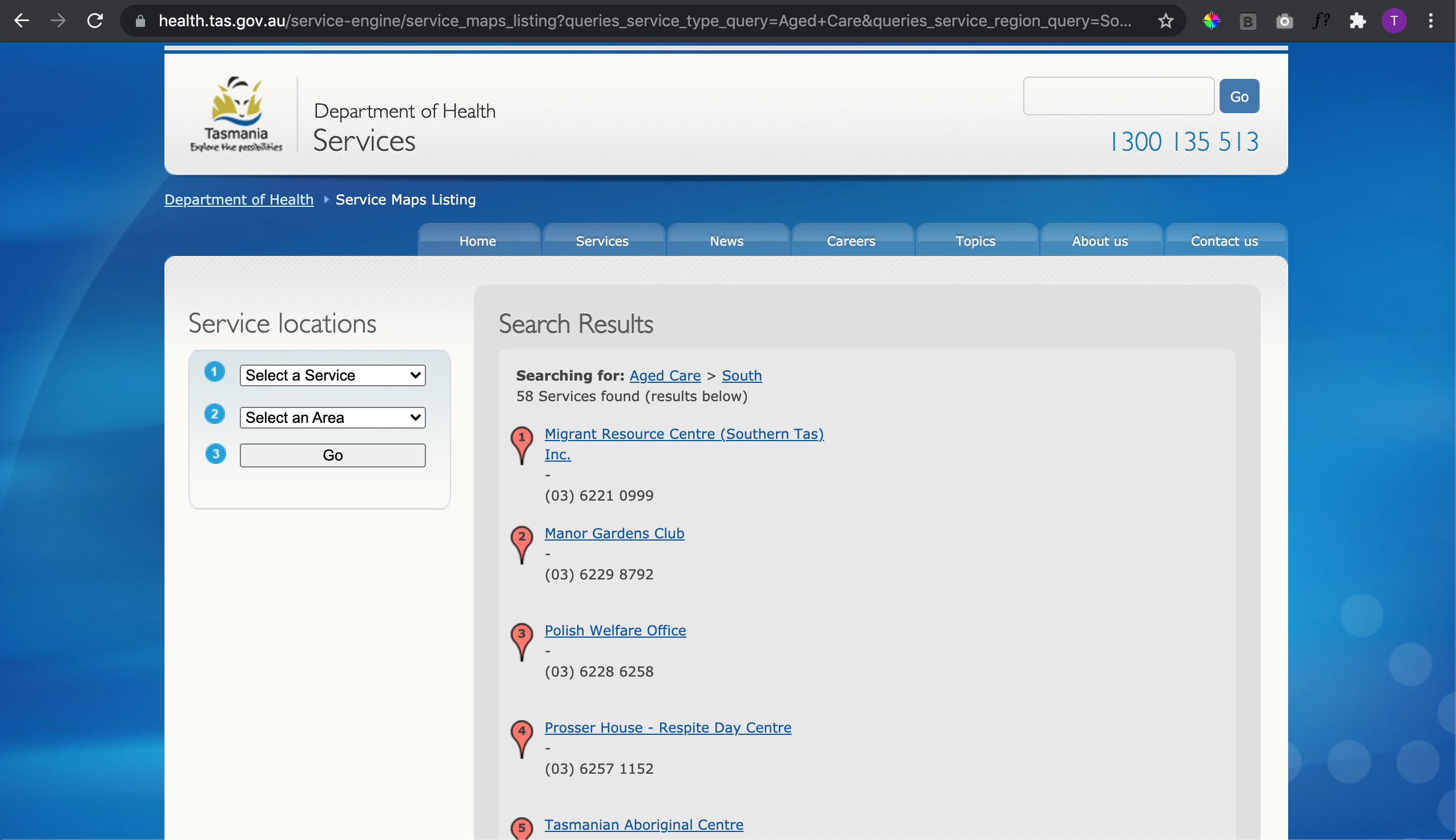
The case for needing a new website was pretty strong. Their old one was difficult to use and navigate, information was hard to find and user experience was not optimal. The site was not mobile responsive and accessibility was poor. The most used area of the website was the search bar, assuming that users skip the website browsing all together.
Context
Government client, I worked inside the Agency to provide a refresh of their site. Brought on to create the branding, UI and component library design system. All done within Figma including client showings with interactions.

The new site
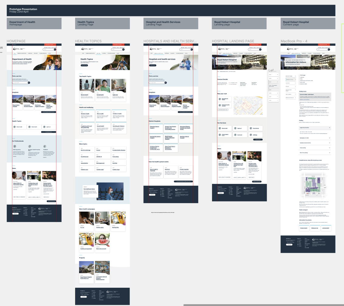
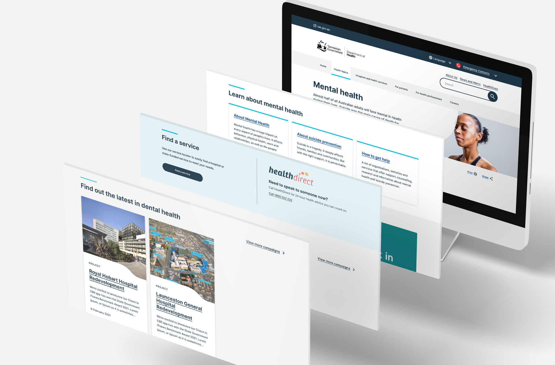
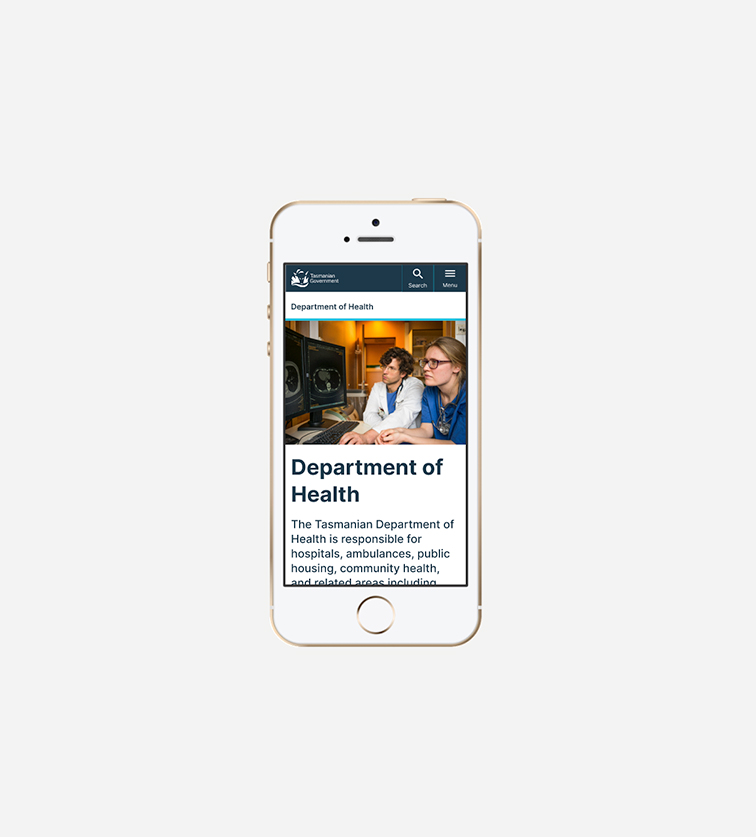
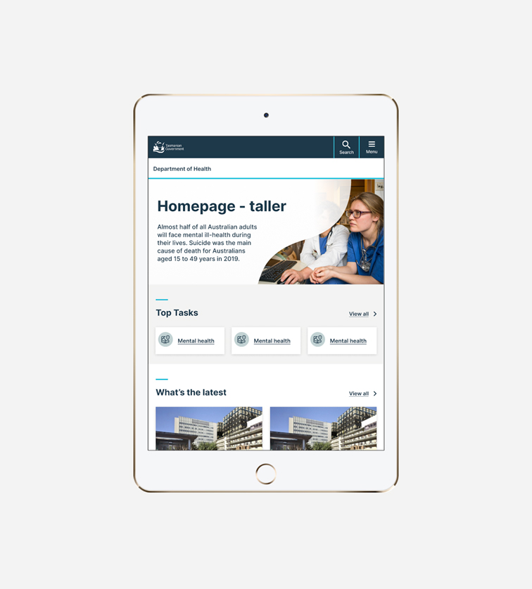
Simple, professional and easy to navigate with a an updated scheme suitable for gov health client. All pages created to a new template design, modules and components. The new site design was delivered with desktop mobile and tablet viewports.

Pages
UX lead provided the IA and page structure, module requirements and tile names. Pages included informational, search, directory pages with the team discussing how best to create user friendly designs and translated into something that could fit within the component library. Collaborative workflow with plenty of reviews with the dev team as well throughout the process. All up the client was very happy with what we delivered, in a timely, smooth and communicative manner. We addressed all of their concerns within each showing which gave them confidence and trust in our work. Client mentioned this has been a long awaited upgrade to a clunky site so also had many stakeholders reviewing our designs. The collaboration was pleasant and easy.


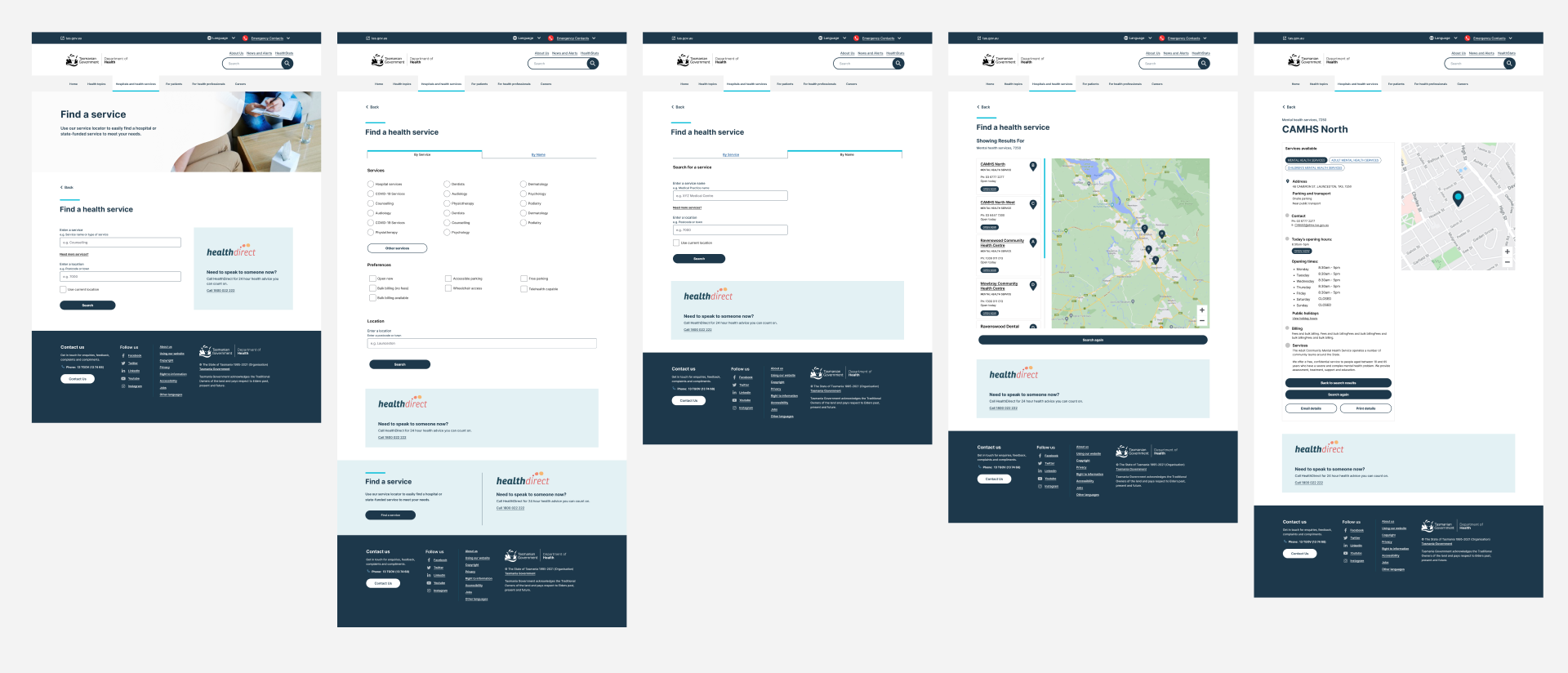
Find a service
User flow and design created by product designer. I created the banners leading to this page.
Find a service allows users to access services relating to health through an external search engine specialised in providing health service directories. This newly created feature of the site allows better access to the right services by many different demographics of the local tas community, taking pressure off the hospital landlines and emergency lines. The usability of these new screen designs were user tested by 5 or so participants of different ages education and professions. The feedback was positive with plenty of great feedback on how they would use this particular feature of the site. I prepared the prototype for the testing session and the UX lead lead the user interviews, I took notes and implemented the recommendations into the designs.
Responsive Design
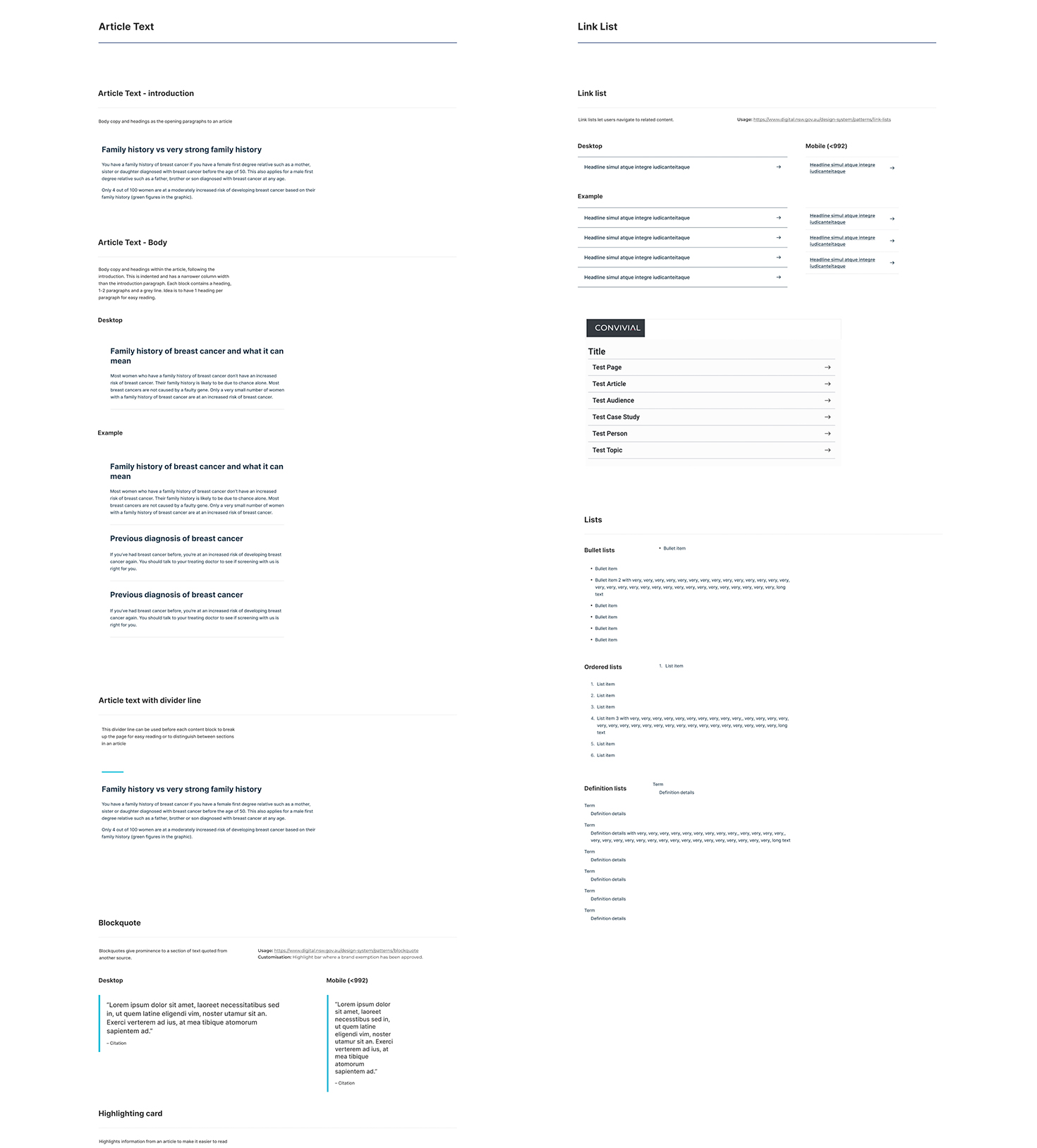
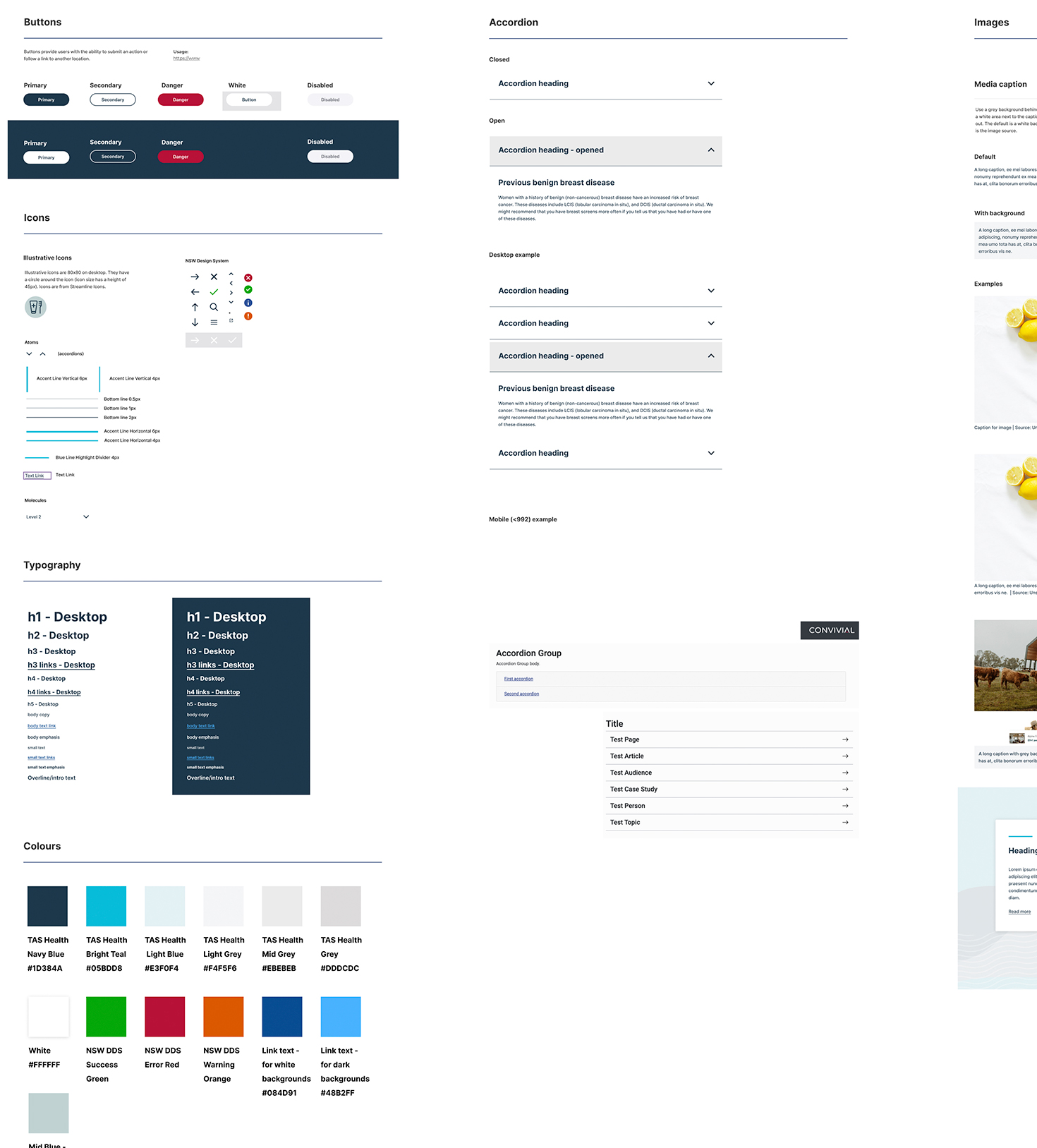
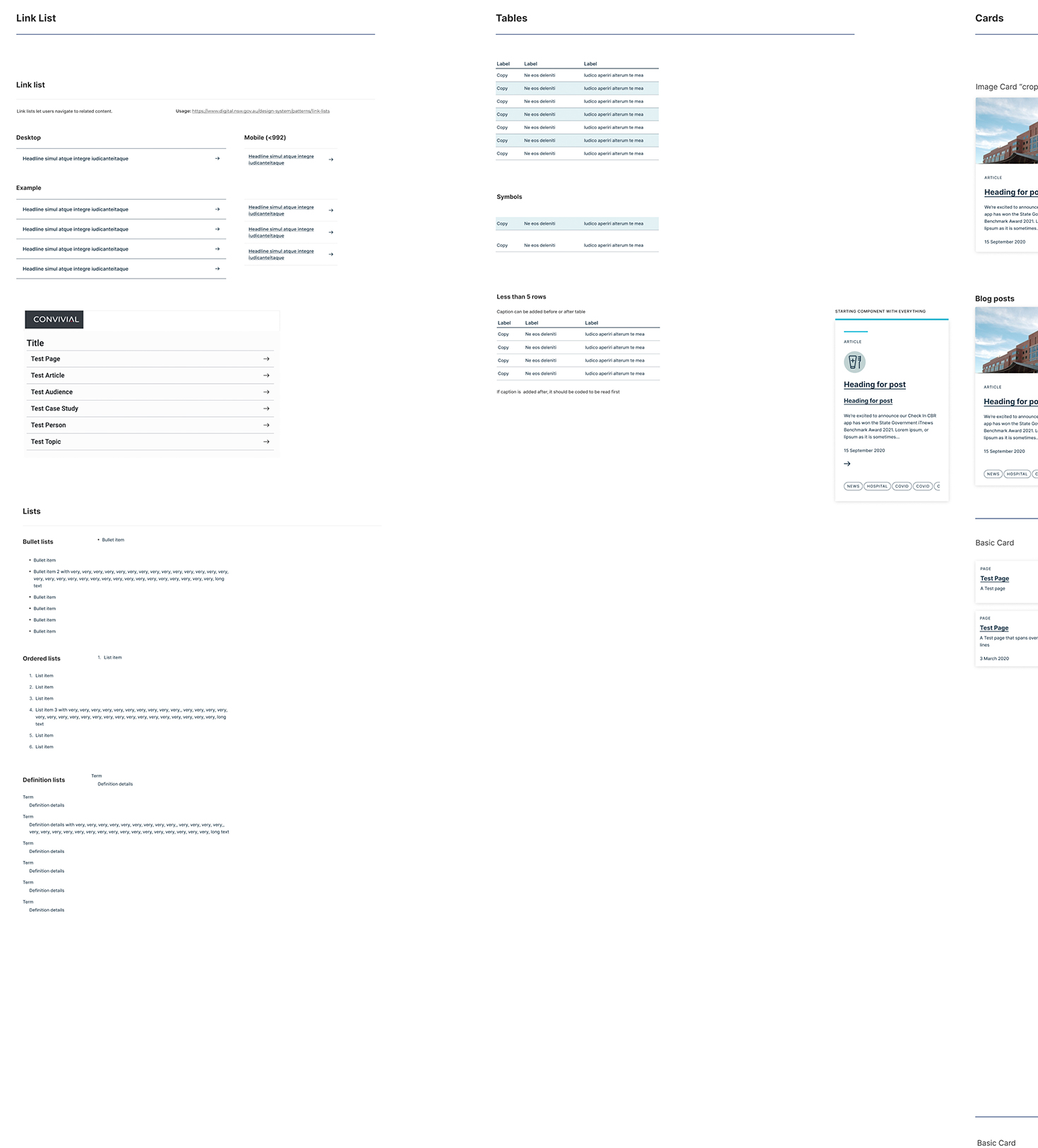
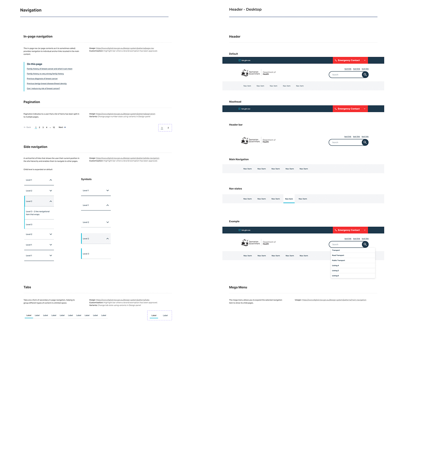
Liaised pretty closely with the lead dev who approved our components. There wasn’t a lot of limitations in terms of design library as the dev interpreted most of what we created. The only limitation was to keep the component library quite paired down and simple, using the least amount of components as possible to cover all of the use cases. Focus was on usability, componentisation and consistency. We also create a dark and light version of all components which could be input into their CMS.
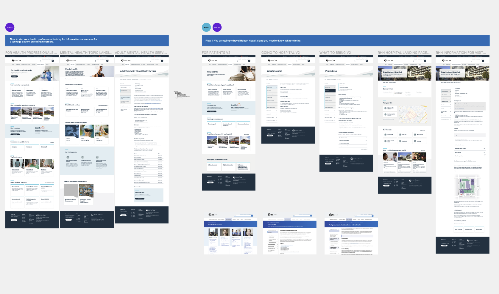
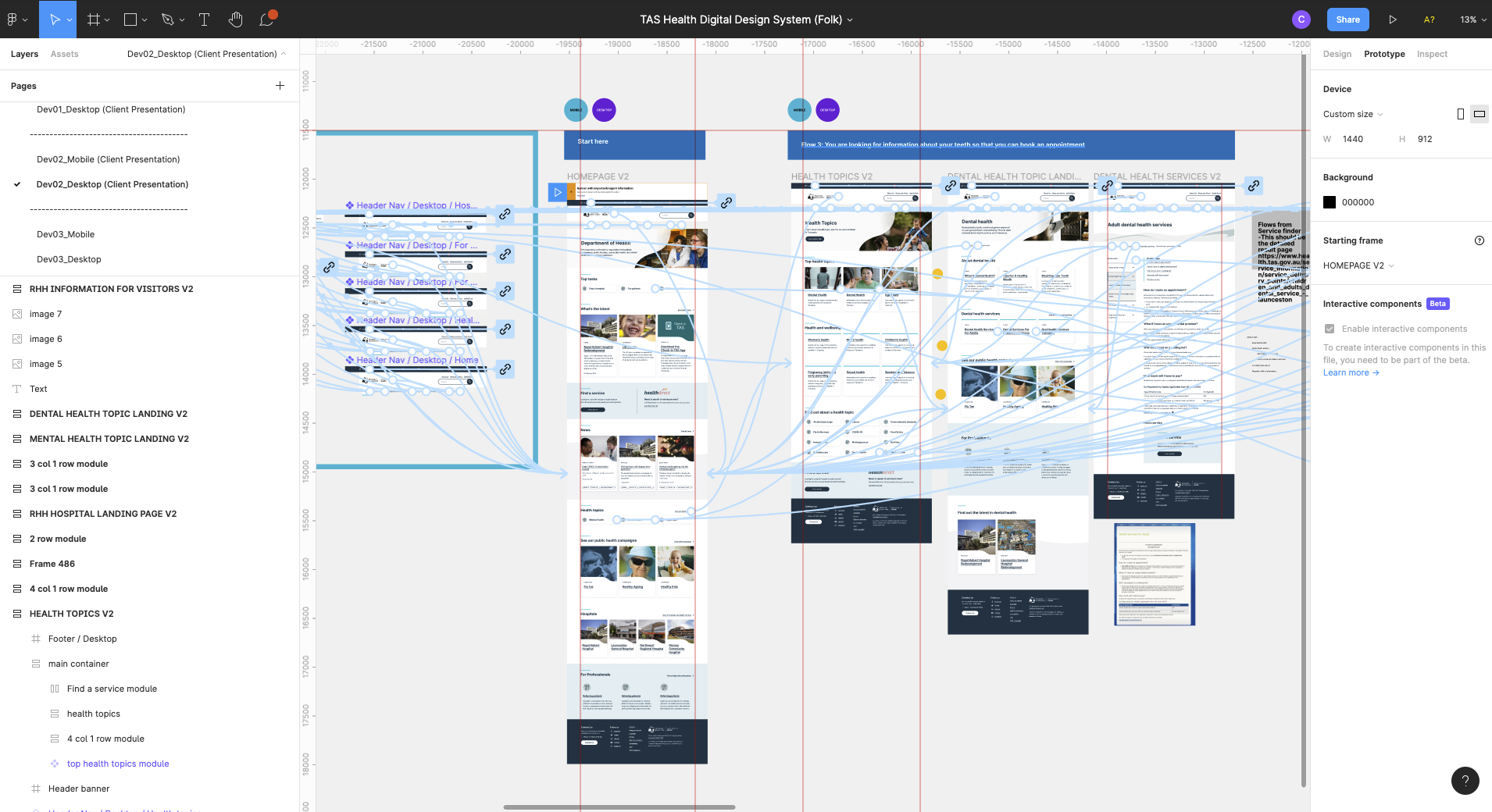
First part of the process focused on the design styling and templating. Second part on page templates based on UX recommendations and review then finally the component library handover. Client presentations also included interaction designs created in Figma.
Process
Software used: figma
What we designed in the process:
- branding and concepts
- wireframes
- flows
- page templates
- component library
- interactions
What was delivered:
- a basic component library that was enough to cover for most use cases
Flows
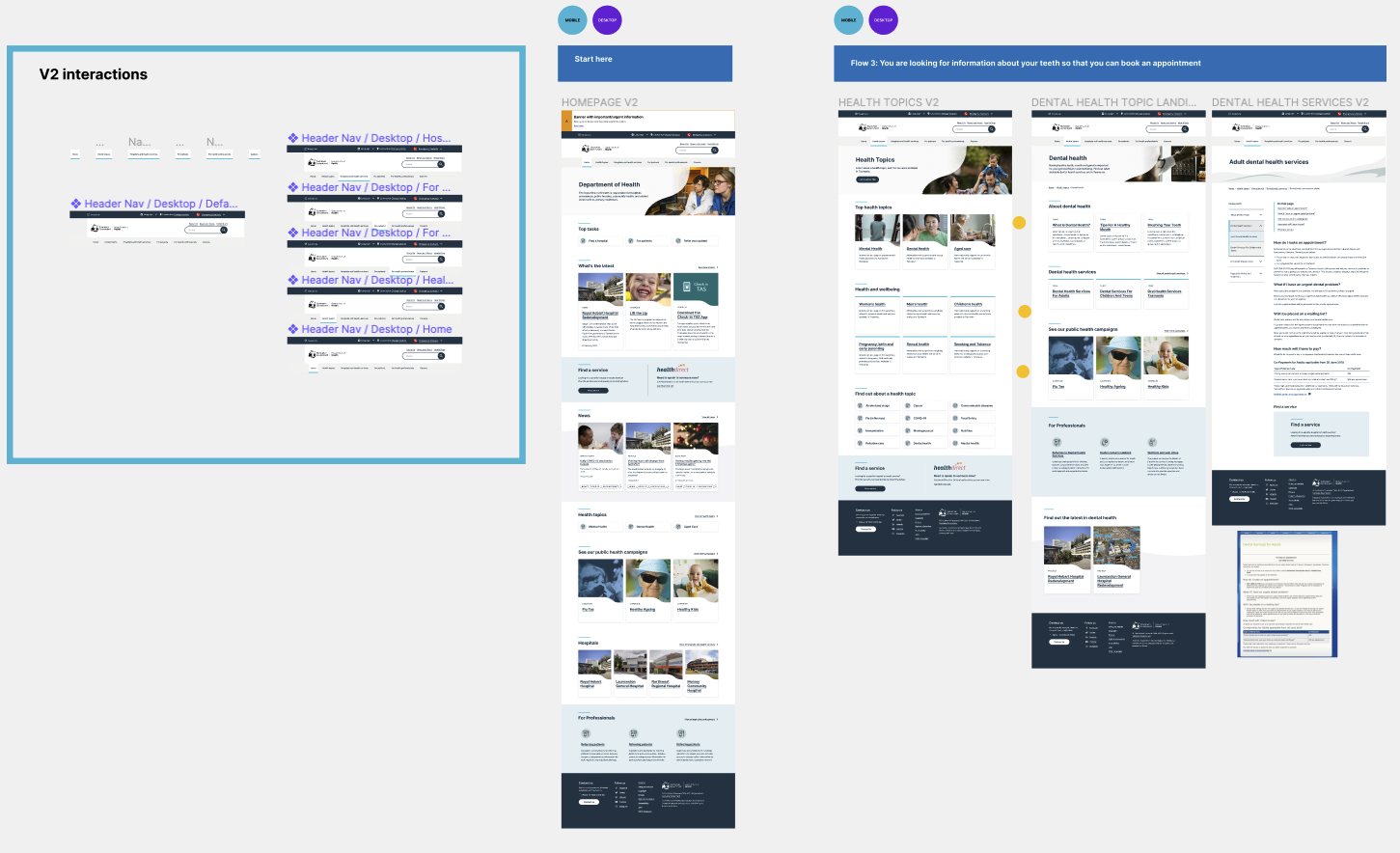

UX
We had a UX/service designer do most of the research which involved an audit of the entire site and it’s hundreds of pages. At the conclusion of the audit they found that most of the pages were rarely visited and most of the traffic was by users looking to find a service. Worked with UX lead and a service designer and product designer. As the sole UI/UX designer I received the UX wireframe with content and images to add in. I got started on creating the component library with approval from head of design. The product designer worked on the find a service page desktop and mobile and I work on the rest of the page templates desktop and mobile. We had a couple of presentations with the client to showcase the designs, about three rounds; first showing the brand styling and then the homepage hero and then the rest of the templates. UX lead lead the user research and interviews and I was the support. Accessibility was also a focus for this Gov health client so full AAA WCAG was used.
