Matrix Education
Re-Designing an Education Platform for Nationwide Expansion
Leading the UX to improve website IA Navigation and page templates to optimise for browsing resources and increasing enrolments. Reshaping the site experience to make finding the right course easier for students and parents.

Problem Context
This project was a long-anticipated redesign, initiated after years of incremental changes had left the existing content-heavy website cluttered with no consistent structure for all the different course types, resources and blog posts, making it difficult to navigate. The redesign was driven by a need to support both immediate business growth and long-term expansion into new states.
Challenge
Untangling the Confusion: Bringing Clarity for Easy Course Discovery that also Promotes Trust in Matrix’s quality and teachers
Matrix Education is a leading tutoring provider in NSW, known for its academic excellence, top-tier teachers, and deep library of high-performing resources. As the business prepared to expand into Victoria and other Australian states, its website needed a complete UX overhaul — the homepage was cluttered, course discovery was difficult, and the navigation had become inconsistent over years of piecemeal updates. The site no longer reflected the quality or ambition of the brand. There was a need to restructure the site’s navigation, course layout, and content flow. The goal was to simplify the browsing experience for students and parents across Years 3–12, while supporting business growth and increasing sign-ups for HSC, OC, and Selective School programs.
Site Pain Points → Goal: Conversions
- No clear navigation / lacking a clear site map concept.
- Information architecture is based on business/product needs rather than the user journey.
- Unclear product navigation on the pricing page and weak connection to the course page (e.g., no clear “how it works”).
- Free trial offering is not easily visible or emphasized.
- Users can’t pick and choose or 'add to cart' from the sales page (despite having multiple product options).
- Unclear what’s included in a term, what’s in holidays, and how the course is structured.
- Users struggle to understand which product is the right fit for them.
Approach
Creating Structure, Strategy, and Simplicity for Course Discovery
As the Lead UX Designer, I began by conducting competitor research across high-trust education platforms (e.g., UNSW, Harvard) to understand how users expect to browse and select courses. Re-mapped the IA and navigation system from scratch, introducing clarity around term vs holiday courses, which were previously confusing even to internal stakeholders. Identified and leveraged Matrix’s blog archive — a rich SEO driver — to propose contextual course promotion directly within high-traffic articles. Delivered wireframes, sketches, and journey mapping sessions to reframe how users discover content, including clearer book previews and teacher insights in FAQs. Facilitated frequent reviews with the CEO to align structure with conversion goals, including surfacing Google reviews as a trust element. Balanced UX clarity with technical constraints, navigating design–dev tensions around how to prioritise complex offerings in a simpler interface.
Designing a Clear Path from Discovery to Sign-Up
To increase student sign-ups, I mapped out the key entry points—homepage, blog, and teacher profiles—and simplified the journey to enrolment. I restructured the navigation to surface high-intent pathways and added clear links to course pages from the most visited sections of the site. On the course page itself, I reduced visual clutter, focused the layout around 'Book a Free Trial' and 'Enrol Now' CTAs, and redesigned the pricing matrix to clearly show all inclusions—making it effortless for parents to compare and take action.
Site Opportunities → Goal: Conversions
- Blog posts (SEO high traffic)
- Newsletter sign-ups
- Guides & Workbooks
- ATAR calculator / Best school pages (SEO high traffic). (Clear nav → sales page)
- Point of difference (how it works clearly communicated)
- Understanding customers' purchase journey
(i.e., how they choose, what factors in consideration) - Homepage above the fold → frequent traffic
- Free trial – rename (“free trial lesson”)
- Users are actively looking for info
Collaborating Across Stakeholders - Developers and Small Business Owners to Guide a UX-First Redesign
I worked with the developer agency Random Blowup, collaborating closely with their project lead, a UI designer, and Matrix’s CEO. The CEO was hands-on, passionate about growth, and focused on increasing student sign-ups from Years 3–12 across HSC, OC, and Selective School programs. My role was to define the UX strategy, create the structural framework, and handover the wireframes to the digital designer to ensure the interface followed both user logic and business goals.
Outcome
A Clearer, Conversion-Ready Experience Built to Scale and convert more student visitors into sign-ups
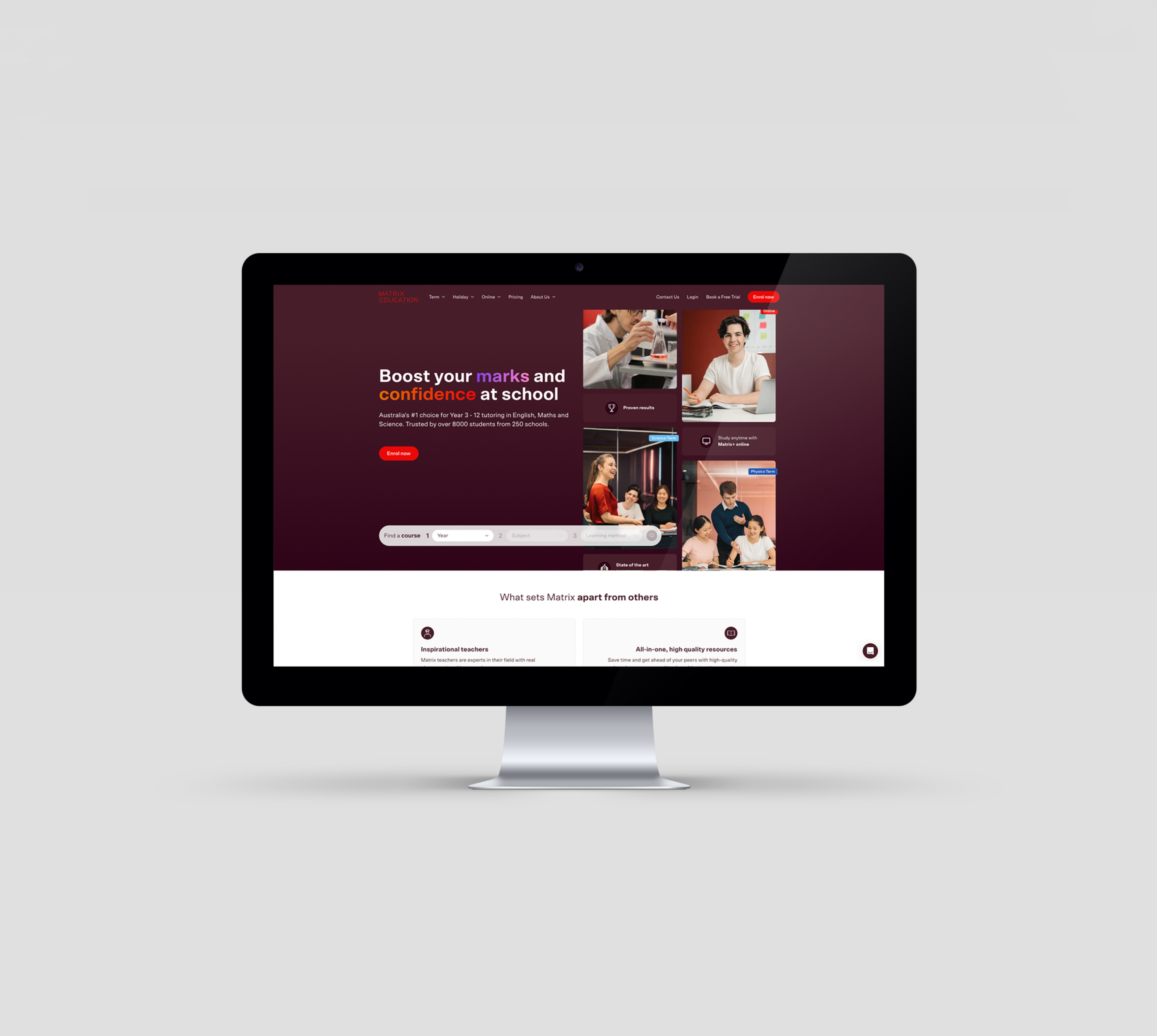
The final UX significantly improved site usability and discoverability of courses. The new navigation system brought order and logic to a previously disjointed experience, while the restructured homepage now presents a clear value proposition and easier entry points into the core offerings. SEO-rich content is now integrated into the broader acquisition strategy, positioning Matrix to convert more student visitors into sign-ups as they expand beyond NSW.
Role: Lead UX Designer
Platform: Figma | Web | Goodnotes
Skills: UX Strategy | Wireframes | IA
Client: Maxtrix Education (via Random Blowup Agency)
Year: 2023
Final Outcome: Visit the new Matrix Education Site
Before Re-Design: See the website before the re-design
